

- VOLUME 85: What Colour Frames Suit Me? A Quick Guide by Skin Tone, Hair Colour & Wardrobe
VOLUME 85: What Colour Frames Suit Me? A Quick Guide by Skin Tone, Hair Colour & Wardrobe
Sunday, 1 March 2026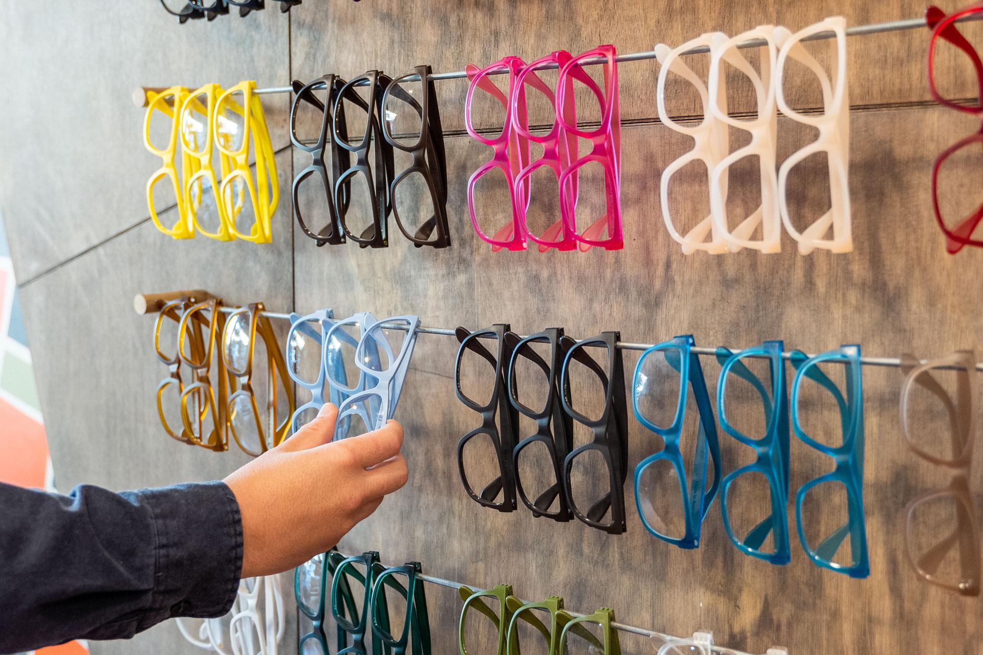
If you’ve ever tried on a pair of glasses and thought, “These should work… so why do I look washed out?”, you’re not imagining it. Frame colour can change your whole look the same way a great (or not-so-great) clothing colour can.
The tricky part is that the “best colour” isn’t one universal answer. It depends on three things working together:
- Your skin undertone (warm, cool, or neutral)
- Your hair colour (and whether it’s natural, dyed, highlighted, or going grey)
- Your wardrobe palette (do you live in neutrals, bold colours, earthy tones, or all-black?)
This guide gives you a simple way to choose frame colours that flatter you, feel easy to wear, and don’t fight your everyday outfits—whether you’re commuting in Toronto, working from home in Calgary, or spending weekends outdoors.
The 30-second answer (Choose this if you hate overthinking)
Use this quick shortcut:
- If gold jewellery usually looks best on you, you tan easily, or your skin reads more peachy/olive: you’re likely warm → try tortoise, honey, caramel, warm browns, olive, khaki, warm clear, gold accents.
- If silver jewellery usually looks best, you burn easily, or your skin reads more pink/rosy: you’re likely cool → try black, charcoal, cool clear, navy, deep green, burgundy, blue-grey, silver accents.
- If both gold and silver look good and nothing feels obvious: you’re likely neutral → you can wear most colours, so pick based on wardrobe (neutrals for versatility, colour for personality).
Then do the wardrobe check:
- Mostly neutrals? Choose one “hero” frame colour or an elevated neutral (tortoise, crystal clear, charcoal).
- Lots of colour/prints? Choose a grounding neutral that won’t clash (black, brown, translucent, navy).
If you want a quick starting point to compare everyday colours, you can browse frames for everyday wear and use the sections below to narrow your pick.
Step 1: Work out your undertone (warm, cool, neutral)
Most people mix up skin tone with undertone. Skin tone is the surface depth (fair to deep). Undertone is the underlying “temperature” that stays pretty consistent year-round.
Here are three easy at-home checks. Don’t stress if one test contradicts another—use the overall pattern.
Undertone check 1: Jewellery test
- Gold looks better? Likely warm
- Silver looks better? Likely cool
- Both look good? Likely neutral
Undertone check 2: Vein test (in natural light)
Look at the veins on the inside of your wrist.
- More green? Often warm
- More blue/purple? Often cool
- Hard to tell, or a mix? Often neutral
Undertone check 3: The “white tee” test
Put on a plain white top and look in a mirror in daylight.
- Do you look brighter in true white? Often cool
- Does true white make you look a bit stark, and you look better in cream/off-white? Often warm
- Both are fine? Often neutral
What if I’m olive or “in-between”?
If you have olive skin, you can land in neutral or warm-neutral territory, and some super-cool colours can look harsh. In real life, olive undertones often look great with:
- tortoise and warm browns
- deep greens
- translucent/clear frames
- warm metallic accents
If you’re unsure, treat yourself as neutral and let your wardrobe do the deciding.
Step 2: Pick colours that flatter your undertone
Once you know your undertone, frame colour becomes much simpler. Think of it like choosing colours that echo what already looks harmonious in your colouring.
If you’re warm-toned
Warm undertones usually look best in colours with yellow, golden, or earthy bases.
Everyday winners
- tortoiseshell (especially honey or caramel tones)
- warm browns and chocolate
- olive/khaki greens
- warm clear or champagne translucent frames
- gold accents
If you want a bolder look
- mustard
- warm red (tomato/brick)
- teal that leans green
- coral tones
Colours that can be tricky
- icy pastels
- blue-based pinks
- very cool greys (they can make warm skin look a bit sallow)
If you’re cool-toned
Cool undertones often shine in crisp, blue-based, and jewel-toned colours.
Everyday winners
- black and charcoal
- cool clear (crystal/grey translucent)
- navy
- deep green (cool forest tones)
- burgundy/wine
- silver accents
If you want a bolder look
- cobalt blue
- plum
- bright cherry-red (blue-based)
- magenta-leaning tones
Colours that can be tricky
- very yellow-leaning browns
- warm oranges and mustard (they can clash)
If you’re neutral-toned
Neutral undertones can wear most colours, so the challenge is choosing colours you’ll actually wear often.
Everyday winners
- classic tortoise
- black
- translucent clear
- mid-brown
- navy
- soft grey
If you want a bolder look
- choose one colour that already repeats in your wardrobe (green, red, blue, purple) and make it your signature frame.
Step 3: Use your hair colour as the “frame enhancer”
Hair colour can make the right frames look even better—or make a good choice feel slightly off. The goal isn’t strict rules. It’s balance.
Blonde hair (natural or highlighted)
Blonde hair can be overpowered by heavy black frames (unless you want strong contrast).
Flattering options
- light tortoise
- champagne or honey translucent frames
- soft browns
- clear frames
- pastel or muted tones (especially if you’re cool-toned)
Brunette hair
Brunette hair is versatile and can carry both neutral and colourful frames.
Flattering options
- tortoise in mid-to-deep tones
- black/charcoal
- deep green
- burgundy
- navy
- clear frames for a softer look
Red hair (natural or dyed)
Red hair often pairs beautifully with greens, tortoise, and warm metals. Some reds are warm (copper), others lean cool (berry).
Flattering options
- olive and deep greens
- warm tortoise
- champagne translucent
- warm browns
- gold accents
If your red is more berry/cool, try
- black
- charcoal
- burgundy
- cool clear frames
Grey or white hair
Grey hair can make many colours look more polished and modern—then it’s your choice whether you want softness or contrast.
For softness
- clear frames
- soft grey translucent
- light tortoise
- muted blues/greens
For contrast
- black
- navy
- deep green
- bold red/burgundy
What if I dye my hair often?
If you change hair colour regularly, prioritize wardrobe harmony over hair harmony. Choose:
- a neutral you’ll wear with everything (clear, tortoise, black, navy)
- or a colour that repeats in your most-worn clothing (for example, green or denim tones)
Step 4: Let your wardrobe make the final call
This is the step most guides skip—and it’s what makes frames feel effortless.
Look at your most-worn colours. Don’t count the “special occasion” outfit. Count what you actually wear weekly.
If you wear mostly black, white, grey, and denim
You’ve got a clean base, so you can go two ways:
- Elevated neutral: black, charcoal, clear, tortoise
- Statement pop: red, green, cobalt, patterned frames
If you wear lots of earthy tones (beige, tan, brown, olive)
Lean warm and grounded:
- tortoise
- honey/chocolate browns
- olive/khaki greens
- champagne translucent
If you wear lots of colour or prints
Your outfits already stand out, so frames should either:
- anchor the look (neutral frames)
- or pick up one repeated colour you wear often
If you dress corporate or minimalist
Go for “quiet confidence” colours:
- black
- charcoal
- navy
- dark tortoise
- cool clear
Step 5: Match frames to the vibe you want
Two people with the same undertone can choose totally different frames based on the effect they want.
Want to look more approachable?
- translucent frames (clear, champagne, smoke)
- light tortoise
- softer colours (navy, warm brown)
- thinner profiles
Want to look sharper and more defined?
- black
- deep tortoise
- deep colours (green, burgundy, cobalt)
- thicker profiles
Want a creative, design-forward look?
- unexpected colours (mustard, teal, lavender, bold red)
- two-tone frames
- bright colour blocking
If you want to experiment, start by shortlisting three options: one neutral, one “safe interesting,” and one bold. A simple way to start is to shop quality frames online in canada and filter by colour.
Common mistakes that make frame colours feel “wrong”
- Choosing a colour you love in theory, but never wear
- Picking a frame that’s too close to your skin depth with no contrast
- Going very warm when you’re cool-toned (or the reverse)
- Ignoring hair changes (especially going lighter or greyer)
- Buying a statement colour as your only pair
Comfort matters too (because style isn’t worth headaches)
If your frames pinch, slide, or sit oddly, you’ll stop wearing them—even if they look amazing.
If you’re getting frequent headaches or eye strain, it’s worth checking your prescription and eye health. For general guidance, you can read the national institute of health overview on eye health and vision care.
A practical “choose your frame colour” checklist
Non-negotiables
- Works with your undertone
- Works with your wardrobe
- Has enough contrast to look intentional
Nice-to-haves
- One neutral pair + one fun pair
- A translucent option for softer everyday wear
- A bolder pair for events/photos if you love statement looks
The 3-frame method (easy mode)
- One everyday neutral
- One elevated neutral (tortoise or clear)
- One personality colour
To compare a range without overcommitting, you can start with affordable frame options and shortlist from there.
Frequently Asked Questions
What colour frames suit warm undertones best?
Warm undertones often suit tortoise, honey/caramel browns, olive greens, warm translucent frames, and gold accents.
What colour frames suit cool undertones best?
Cool undertones often suit black, charcoal, navy, burgundy, cool clear frames, and silver accents.
What if I’m neutral-toned?
Neutral undertones can wear most colours. Choose based on your wardrobe and the vibe you want.
Do black frames suit everyone?
Black can work for many people, but if it feels harsh, try charcoal, deep tortoise, or smoke-translucent.
Are clear frames still in style?
Yes. The best clear is the one that matches your undertone—warmer champagne for warm undertones, crystal/smoke clear for cool undertones.
What colour frames suit grey hair?
Clear frames, soft grey translucent, light tortoise, navy, deep green, and (for contrast) black can all work well.